Isabella Ross
Everyone needs a bit of colour in their life! When it comes to our interiors, it is always wonderful to be able to express, create and re-energise a space! So, to provide some inspiration to our readers who are overwhelmed by the multitude of colours to choose from, here is Sydney Observer’s handy guide.
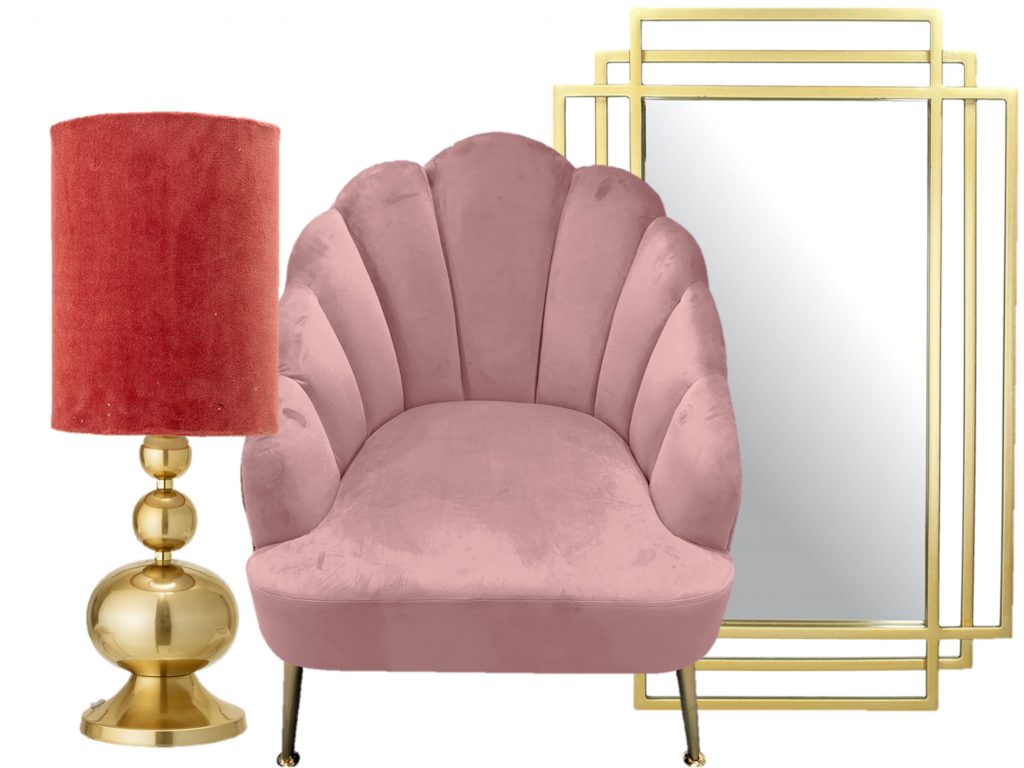
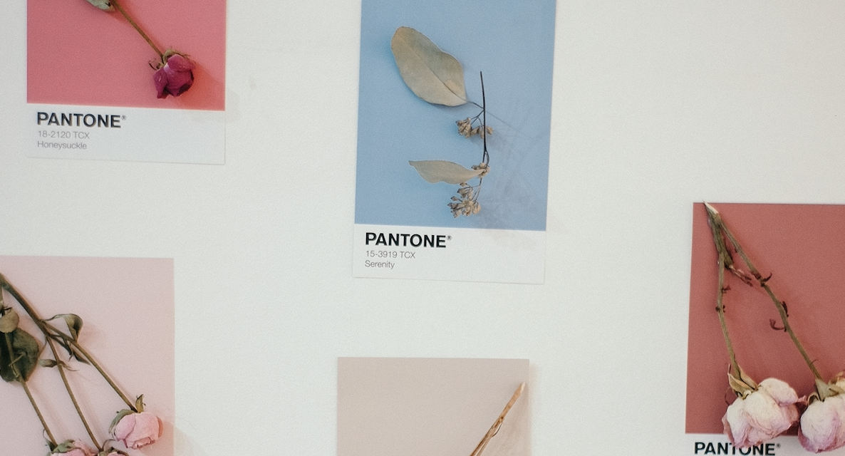
PEACH / DUSTY PINK / GOLD
For a feminine touch, this colour combo is the perfect choice! There is no denying that dusty pink has been incredibly popular as of late, thanks to its muted tone. Initially booming within the fashion industry, dusty pink has now made its way into the design market, especially in terms of furnishings in our department stores like Kmart and Myer. Metals such as copper, gold and bronze work well with this tone of pink, creating the perfect balance between soft and strong. One colour that is trending very recently is the newfound appreciation for all things peach. Ideal to add to the mix with dusty pink and gold, peach’s warm-toned base will inject life into any space.
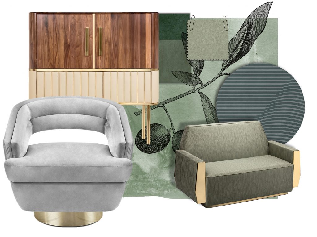
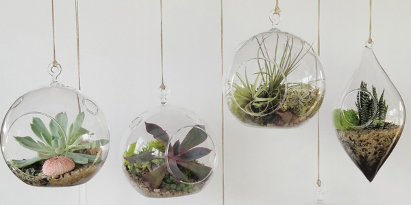
OLIVE / GREY / WOOD
Nature lovers are sure to fall head-over-heals with this colour combination! For a raw, organic theme to your home, this palette is a beautiful choice. Olives can be in a range of shades, including darker and lighter tones depending on the size of a space. For a smaller area of your home it is best to choose a mid-shade olive as this will not only add warmth but also make the room appear larger. Grey is known for its complementary relationship with olive-green, given they are both cool-toned. Even better, you can play with texture in the form of natural wood via cabinetry and flooring. Especially perfect for patios, olive, grey and wood will suit the vast majority of backyard areas. All it takes is a fresh lacquer on your deck, a sleek grey outdoor lounge setting and a freshly painted olive-green fence accented with greenery. For the indoors, this palette in the sitting or reading room exudes luxury! Look to modern styling and natural timber accents.

NAVY / WHITE
A very traditional yet inviting colour palette, this duo is well known throughout the interior design sphere due to its versatility. Navy and white also has a strong resonance within nautical themed spaces, thanks to its nod to the coast. Another theme ideal for this palette is French Provincial. Deep blues have the capacity to ground a room whereas white touches are crisp, clean and classic. One great way to use this palette is by painting your feature wall a rich navy and having white architraves and cornices. If paint is too bold of a step for you, fear not because a simple implementation of soft furnishings should do the trick! Whether it’s navy pillows against a pale-coloured couch, or a navy throw rug along the base of your bedspread, there are plenty of options.
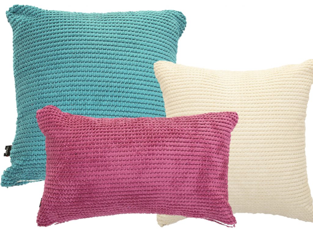
CERULEAN / BERRY / CREAM
Bright and bubbly, this colour trio is wonderfully vibrant. As always, lighter shades like cream are important as you never want your home to be too busy with exuberant hues. Rather, touches of boldness grounded against a calming shade like cream is the go-to. Cerulean and berry isn’t just simply blue and pink. Be sure not to go for a pale baby blue against a millennial pink, as this would work better in juvenile spaces like a kid’s playroom. Instead, cerulean and berry are the more mature selections as their tone is a touch darker. Particularly lovely in bedroom spaces, this combo can be applied easily – opt for a cream bedspread and accent with pillows that nod to the theme of berry and cerulean. For those who love to create and express their artistic talent, one great tip is to make an artwork that reflects the palette of the space. So, for example, paint a picture of a seascape that has touches of cream and berry within it. Splatter and blotch paintings remain trendy too, for those willing to give it a try. Or you can just do a Google search and discover and purchase the painting of your dreams!